The perfect intersection between GIS and abstract art!
One of the things that originally hooked me about GIS was the visual aspect of it. I liked the meeting of data and design to create visualizations of our world. Ocassionally these days while working on projects, I feel that I've lost the beautiful design side. Sometimes you've got to make some pretty stuff just for fun!
One of these unsuspectingly beautiful visualizations is an aspect map. They are pretty easy to make, and playing around with the colours leads to some really beautiful creations.
The above example is pretty fun, and definitely psychedelic, although a tad eye-watering.
What is an aspect map? It is simply a map which corresponds the directional orientation of a hillside. For example, a hillside that faces between 300 and 320 degrees might be coloured red.
Understanding aspect maps comes in two parts. The first is understanding what they are meant for, and the second is understanding how GIS software creates them.
What can we use these maps for? Well, like all things in GIS, aspect mapping is a crucial component in a wide range of fields. In environmental science, aspect maps are used to help estimate variables like soil moisture, sun irradiance, snowmelt, avalanche prevalence and many others. In civil engineering, they are used for road construction, runoff modeling and planning, views (used along with other GIS tools), among others. in other fields as well, aspect mapping is a useful tool.
And the process...luckily its been simplified through the UI of GIS software for us, so the comprehension of aspect maps isnt necessary to click through and make the maps. None-the-less its interesting to see the math and process behind the map. in ArcMap, the tool works like this: (taken from ArcGIS)
The tool uses a 3 by 3 cell moving window to process the data. If the processing cell is NoData, the output for that location will be NoData.
Of the eight cells neighboring the processing cell, this tool requires that at least seven of them have a valid value. If there are fewer than seven valid cells, the calculation will not be performed, and the output at that processing cell will be NoData.
The cells in the outermost rows and columns of the output raster will be NoData. This is because along the boundary of the input dataset, those cells do not have enough valid neighbors.
Aspect is expressed in positive degrees from 0 to 360, measured clockwise from north.


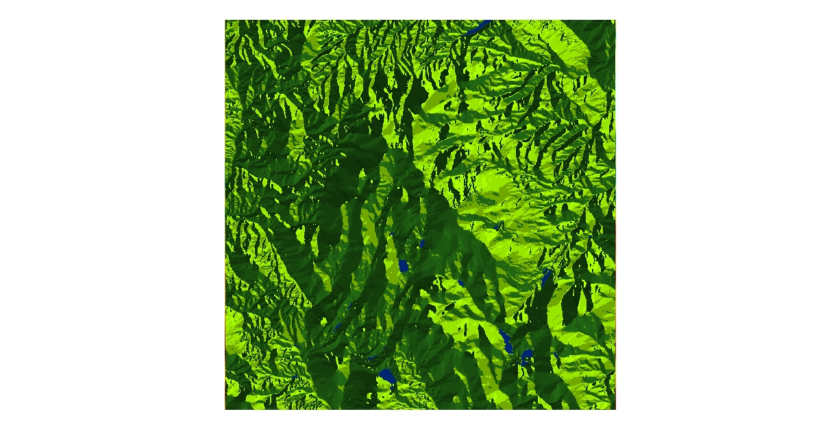
Its quite fun to play around with the colours and classification for these maps. They remind me a lot of some of the mid-century contemporary art coming from France and the U.S. as well as algorithmic art that has been becoming more popular in the last few decades.
Update 2/2020
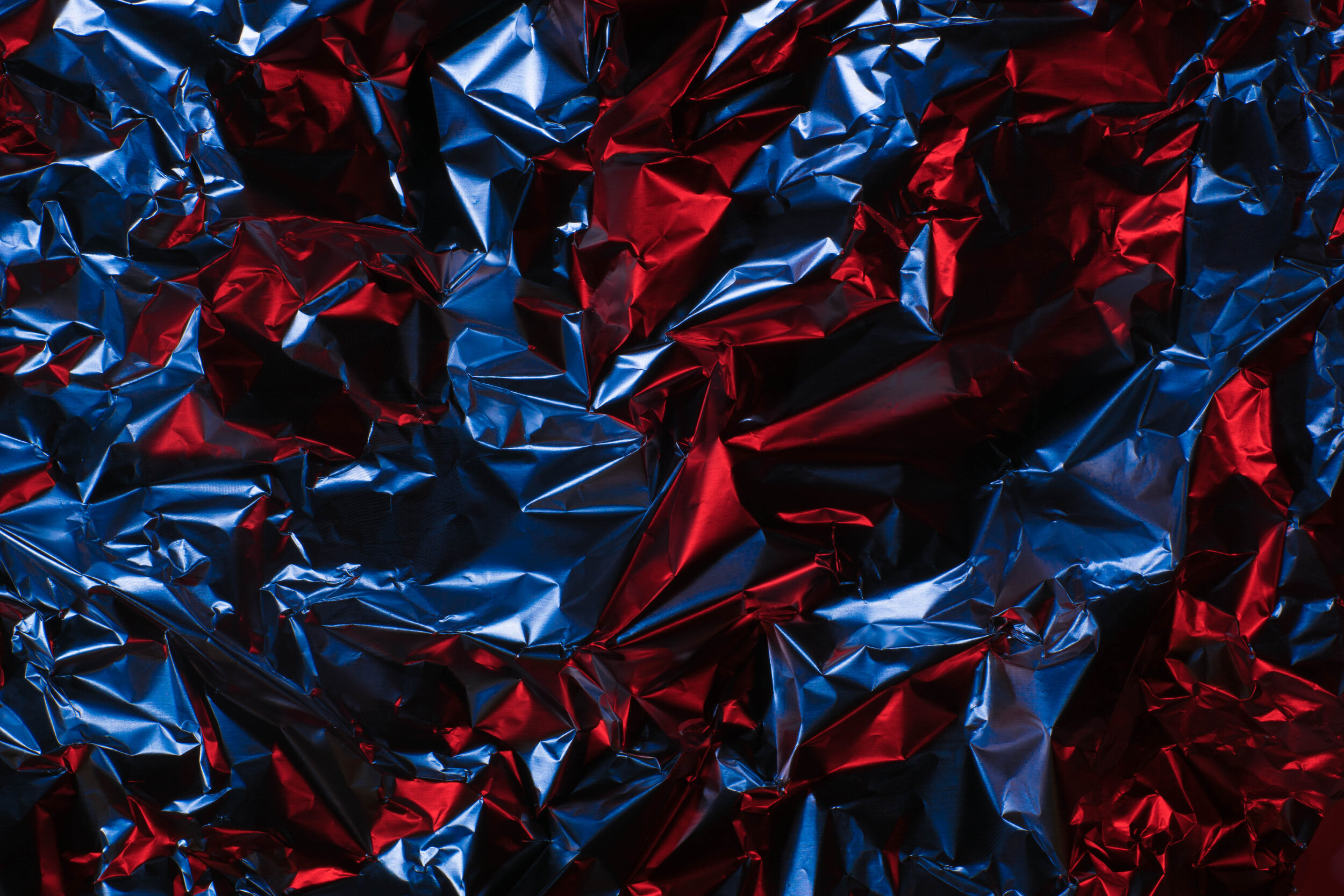
I was thinking about these aspect maps recently, and wondered if I could approximate the look of them with real life methods. Over the course of an evening I cobbled together a rough setup with a downward facing camera, some crinkled aluminum foil, and colour filters for the cameras remote flash. While not exactly the same result as an aspect map, I think they came out looking pretty cool!